If there's one thing that computing has brought to the forefront, it's dealing with logical expressions. We deal with them on a daily basis, but communicating anything more than the most trivial expression to non-technical folks remains a barrier.
Part of this is the looseness (some might say illogical sloppiness) that the English language brings to the table. The casual understanding of the terms "and" and "or" is often different than the rigorous understanding, and this leads to confusion on the part of the lay person. For example, "or" is often assumed to mean "exclusive or", as in "would you like carrots or potatoes" (implying you can have one or the other, but generally not both.) And there are times when, linguistically, "and" is used to mean "or" and vice versa. The nebulous use of these conjunctions makes it difficult to use "natural language" to describe complex conditions without carrying forward a lot of that ambiguity.
Equally oppressive is the use of mathematical notation. While there are those (typically of a technical nature) that have no problem swallowing, say, a SQL select statement, this is a huge turn-off to the casual software user.
So the issue is, how does a designer expose the ability for users—technical or non-technical—to create and understand complex conditional logic that they may need to offer to some software?
Mathematical expressions, despite being compact and precise, are off the table for being too hard to understand, as are Natural Language expressions for being a bit too lax.
Both of these notations are essentially symbolic, and that, I think, is part of the problem. A more natural way to relate to things is visually, as it's more "tangible" in an everyday sense.
| "TEN" |
| When trying to come up with a name to refer to this notation, I bandied about a few ideas. "Visual Expressions" was quickly discarded for a couple of reasons: 1. the Internet seems to be littered with references to "Visual Expression", none of which seemed to be even vaguely related to this subject, and 2. Microsoft's well-known (but misnamed?) "Visual" line of products (I never really understood what was so visual about them anyway! ;-) |
| There were other ideas, too, but none of which really did justice to the subject. |
| Lacking a better name, I'll just call this "Tuerke Expression Notation", or TEN for short. Not the most self-descriptive name out there, but it's unambiguous, and at least it makes a simple, memorable, (and pronounceable) acronym. |
What do I mean? Well, let's take the and conjunction. The rigorous definition of and is that both conditions must be true in order for the whole expression to be true. The or disjunction differs in that either (or both) can be true in order for the whole expression to be true.
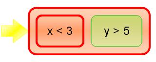
It turns out that there is a simple, visual way of presenting this. If you place the two and operands side by side, you get this:
| x<3 | y>5 |
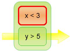
On the other hand, if you place two or operands over each other, you get this:
| x<3 |
| y>5 |
This is very useful, because the premise of the notation is that to determine whether an expression is true, there must exist a horizontal line of expression terms which are all true. The reader never sees the confusing terms "and" or "or", but instead just relies on an imaginary horizontal line. (By the way, what holds true for two operands holds true for any number of operands: one, two, or more; the notation, just like the operations, can be n-ary.)
Visually, too, it should be clear that order does not matter in determining the ultimate result of the expression, reflecting the commutative nature of both and and or.
In order to make this more visual, the individual operands should be put in boxes, and a box should surround each and and or expression. When it comes time to evaluate the truth of an expression, visually distinguishing true and false expressions helps the layperson understand the state of the expression.
For example, representing x < 3 and y > 5 when x is 9 and y is 6 could be done like this:

From this representation we could see that the and expresison is false, because x is not less than 3. Since the expressions are placed side-by-side, it's visually clear that the whole expression is false, since there's no horizontal path through the expression.
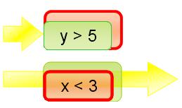
By the same token, x < 3 or y > 5 could be represented like this:

and we clearly see that the expression is true, because despite x not being less than 3, y is greater than 5, and so a horizontal path exists.
As I said, the state of truth of an expression can be shown by presenting true expressions one way and false another. Here, I've picked green for true, red for false (based on the red stop-light metaphor) but any other visually distinct pairs could be used, too. For example, a heavy ("impenetrable") border might represent false, while a hairline border might represent true. (And, of course, consistent combinations are appropriate, too.)

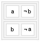
More complex expressions can be built up from these fundamental building blocks. For example, (a and not b), or (b and not a) might be depicted as:

(Note, by the way, that this is just another way of saying a xor b, but in a way that the average person is likely to understand.)
Interacting with such an expression, visually, would similarly be intuitive, and could be done without exposing any of the underlying complexities of creating a logical expression. A drag-and-drop gesture would allow the introduction of new term in an expression. "Docking" such a term beside an existing term defines a conjunction (and) relationship, while docking above or below defines the disjunction (or) relationship. Editing similarly involves dragging expressions around.
This covers the two basic Boolean operations, but the one that's missing is negation. Visually, this is represented by the following:

Visually, you can see that the single operand of negation is isolated from at least one side of the containing box, while the negated state does extend fully left to right. Theoretically, it could be completely enclosed on all sides, but I wanted the symbol to bring to mind the classical "¬" symbol, also used to represent negation. It's also more compact.
From this, it should be obvious to see that you can make very complex expressions quite economically, and in a way that's visually intuitive. Simply by coloring the nodes during evaluation, you can see what the result of an operation is.
In spite of the perhaps novel visualization, it's still quite easy to computationally work with expressions that are presented this way (to convert back and forth between TEN and other notations, or evaluate them) since the internal structure is essentially the same hierarchy as traditional expression evaluations.
Further aiding presentation is the fact that sub-expressions (that is, any "box") can be collapsed down for visual simplicity; the interior boxes can be hidden, and any text aggregated into a classic written expression, or just an ellipsis.


 Generate a QR code link to this page