It’s nice to have a spare minute or two to come back to long-neglected projects. In this particular case, it’s the large-radius curve modules I proposed a decade ago, and started work on three years ago before everyday life demanded my attention elsewhere.
As a brief recap, T-Trak’s corner modules have traditionally been on the tight side for what I consider reasonable operation. Even what is officially labeled as the “Alternate Corner” module utilizes the 315mm and 282mm radius turns in a module that is about 14 inches square, which makes for awkward-looking trains ... at least the kind I was contemplating running, though you have to admit, any train that snakes around gentle curves looks far better than something that does an about-face in the space of a city block or two. In that spirit, I put forth the idea of a “double-sized” corner module: that is to say, the module is exactly two single-modules in width and depth. This both affords a more graceful curve and doesn’t introduce an oddball module size if you’re inclined to do something more complicated than a table-top oval. Using modules like this allow the 310x310 module grid to be preserved.
The problem that kept me from moving forward, as you’ll recall, was that that of KATO track not coming in the necessary radius to make this module from stock Unitrack pieces, an aspect I really wanted to keep in the module designs, just to keep things easy for everyone. Happily, T-Trak sophistication has really taken off in the intervening years, so I started to feel better about basing a module on flex-track with only the ends being Unitrack.
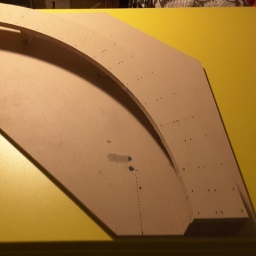
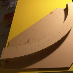
This takes us up to the 2016 holiday season when I had the chance to make some sawdust by creating a 2 x 2 module out of some ¾" MDF, and a dual-track right-of-way complete with easements a la the spline technique. MDF is heavy stuff and a 24¼-inch square of the stuff is really quite cumbersome, so I lopped the two opposite corners off, as per the design previously posted. Not surprisingly, this made the module significantly lighter, while still leaving enough space for some scenery options.
| Module Origins |
 |  |
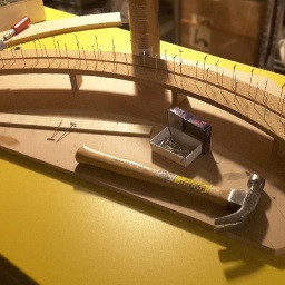
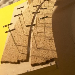
As I previously wrote, flex-track needs to be boosted to Unitrack height with the benefit of some cork, which I had cut into strips. Of course, other modelers will also be aware of the acoustic benefits that cork roadbed offers, so this was a double win. I glued and pinned the strips to the MDF causeway, stopping 28mm short of the ends of the module, to allow room for the 29mm end pieces that would terminate the flex track in a joint-free transition.
| Laying the Cork |
 |  |
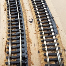
One other detail I’ve been wanting to incorporate into the module has been super-elevated (that is, banked) track. A very old-school—but quite effective—means of doing this was with strips of tape cut half an inch wide. This was laid along the outer edge of the track center-line. I found the mid-point of the curve and laid the tape down on top of the cork from this location back towards the ends of the turn (but not all the way.) One layer of tape is not nearly enough to provide meaningful superelevation, but several layers are. The first layer came to about 12 inches of the module ends, while the next layer was put down on top of it, coming within 10 inches of the module ends. A 3ʳᵈ and 4ᵗʰ layer each came progressively closer to the ends of the track, gradually building up the super-elevation, with a fairly gradual vertical easement as you enter and leave the turns.
| Superelevation |
 | 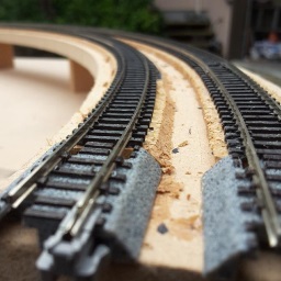 |
In retrospect, the superelevation was probably too subtle: I think one or two more layers at its greatest would produce a better result, but this being the first instance, I decided to err toward caution. Between the easements and the superelevation, though, trains coming through these curves really look quite graceful. Nothing quite says “toy train” like some rolling stock slamming into a fixed-radius curve, then snapping back out onto straight track. This module has none of that.
The track was then secured to the roadbed using E6000; I wasn’t sure if some PVA/white glue would hold to the tape. This, too was pinned to hold it in place while the glue dried.
| Wood to Concrete |
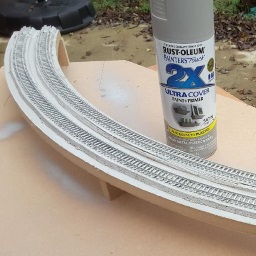 |
Since the flex track had black ties (or sleepers to the UK-derived) once the glue had dried I gave the roadbed a shot of gray paint to at least suggest concrete ties. Admittedly, the tie profile is not right, but to my mind, at 1:160 scale we’re approaching the Rayleigh criterion, and only a total rivet-counter is going to bend down to make sure the profiles are correct. As modelers, we get away with suggesting a multitude of leaves using chunks of ground foam, as well as suggesting distant landmarks with some simple brush-strokes on a backdrop, so we can suggest concrete with gray instead of black. It’s a compromise I can live with... (for now, anyway).
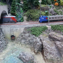
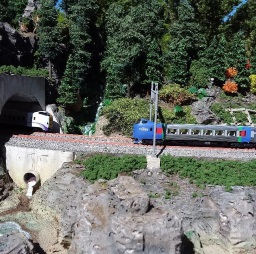
The module sat—languishing for want of attention—for a half a decade until I could find both the inspiration for the scenery and the time to make that happen. I settled on some rugged shoreline evoking the Hokkaido coast: steep igneous cliffs that the track wended past. A small tunnel (foreshortened for practical reasons, since a prototype railroad’s engineers might have blasted away the finger of rock) would act as a scene break between what lay to either side of the module.
The vision set, I glued down sheet foam—leftover expanded polystyrene (EPS) packing material—I had accumulated. Rather than sending this stuff straight to the landfill (most waste companies won’t take it in recycling) I’ve explored “sequestering” it in my scenery, and so far, I’ve been quite pleased with the outcome. Of course, it’s nowhere near as durable as plaster, but nowhere near as heavy, either... something worth considering for modules.
EPS is also very sensitive to chemical attack, so that limits the kind of glue one can use. I put a surplus of white glue to the task, and this works quite well. (If you have young children, you no doubt know of their propensity to make “slime” out of the stuff.) Other glues—such as contact cement—will just melt the stuff away. The rub is that the glue tends to dry rather slowly, but there is a plus to this in that you can come back later and still move things around a bit if your original layout of foam wasn’t to your liking.
A craft-store foam cutter makes fairly quick work of sculpting the sheets and blocks to a more natural landscape. A little bit of time spent here can make the EPS itself look rather rocky, without the need for plaster casts. I may go back and revisit this later, where the irregular surface just becomes a better surface to adhere castings to, but for now, I’m pleased with the effect of carved raw foam.
| Terraforming the Styrofoam |
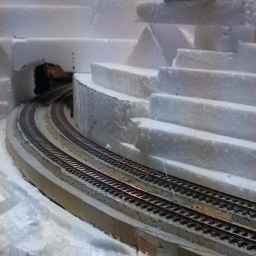 | 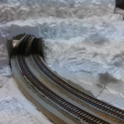 |
| Since the foam came in sheets, it was just a matter of terracing layers into contours, then coming back to shape the slopes... and eventually, the rock detail, with an electric foam-cutting tool. |
There were a few places I felt I had to in-fill a bit. In keeping with the lighter-is-better theme, I went for some sculptamold—a mixture of paper fiber and plaster—for this. I created small batches of this, getting it to the consistency of tuna salad: a stiff but mushy substance I could press into crevices and along edges to the terrain, then push or sculpt into a shape I would be happy with.
Once that dried, I got out a bucket of flat latex oops paint—a particularly suitable warm brownish charcoal tint that really suggests igneous rock—which I used to cover the foam. This serves both as a base color coat as well as strengthening the foam quite a bit, since we’re basically providing a rubber skin to the scene.
| Painting the World |
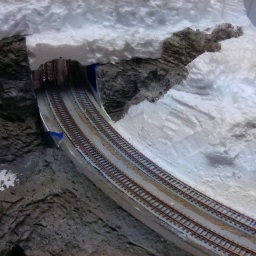 | 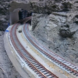 |
| A combination of techniques and color variations helps convert a snow-like land into something that looks more geologically realistic (of somewhat austere). |
Once dry, I went back and applied a second coat to cover the places I missed, making use of some lamp-black pigment to darken the paint. (Most of the places I missed were underneath rock features; the darker paint helps emphasize this by darkening what will eventually be shadow.) With the coverage complete but a bit of the left-over darker paint, I diluted it slightly so it became a wash, which I used to “baste” the remaining rock to further emphasize shadow. I also dry-brushed some of the base paint, lightened first with a raw ochre, to work up the highlights (dry-brushing in top-to-bottom strokes) and then with titanium white acrylic paint to further emphasize the carved detail,
| Water Details |
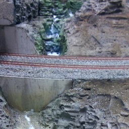 | 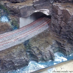 |
| Gloss medium—both in “varnish” and “gel” consistencies—helped make the water look quite wet. The varnish (a mid-viscosity product normally added to acrylic paint to give it a glossy finish, and possibly even a translucency depending on how much you add) when applied straight produces a clear, shiny finish... even though it looks milky when applied. This is applied by stippling to give the surface some texture. The wave crests are formed by applying gloss gel, and then shaped into a wave-like form. This, too, dries clear. Titanium white paint is stippled onto the shore edge (to show retreating waves) and along the wave crests, to suggest sea foam. Repeat this 2-3 times to build up the glossy transparency. |
I sprinkled some fine sifted earth along the bottom of the module to simulate coastal sand, building up a shoreline that led up to the retaining wall (where there would be a culvert that allowed the stream to empty to the sea). Once this was dry, I decided the color was too dark to suggest sand, so I sprayed some thinned out Earth and then Sand paint to lighten it up, over-spraying the sand that would be below sea level. While I had the airbrush out, I got some Glacier Green and blended that along the water’s edge. I followed this with a mixture of Glacier Green and Blue Angle Blue to represent deeper water. I also gave the small stream beds a shot of this blue-green. It looks a bit heavy-handed, but I’ll be going over these with more layers later on, and yes, the water in Japan really does get that color ... at least in some places. I also sprayed a light coat of mossy green coat onto the stream’s sides to hint at moss growing there.
Once all this was dry I used gloss varnish to depict the water, and supplemented that with ridges of gloss gel to sculpt wave forms. All of this went on milky white, but dried glossy clear. This will take a number of additional layers to smooth things out. That will have to wait, though, until the module is more complete. In the meantime, it looks quite impressive, even in its incomplete state.
| Planting the Mountain Stream |
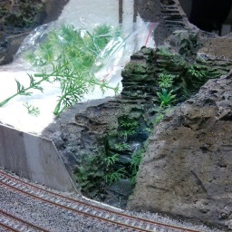 |
I needed to depict the lushness of the mountain stream, so as with earlier scene detailing I cut up plastic fish-tank plants to represent ferns, which I glued to the stream’s edges.
Also as before, I sifted fine soil over the module as the base soil layer, which naturally preferred to cling to the horizontal surfaces, adding a lot of depth and detail. I had played with putting grid beams—a typical Japanese erosion control feature—along the slope. These get built wherever there is concern of mud slides or erosion that they would like to avoid; they’re noteworthy for having the look of concrete waffles that conform to the questionable landscape. These are then left to allow vegetation to grow over them, which is how I decided to create the scene. They’re just strips of styrene glued in place and painted a weathered concrete color (Tamiya light gray, with a wash of earth.) I’ll finish up with squares at the intersections that have the soil nails represented on them... that’s still to come.
Since this isn’t using UniTrack, the catenary towers needed impromptu foundations, formed out of thick sculptamold and with some scavenged base fittings sunk into them. Once dry and hard, these were then painted the same aged-concrete color, basically a number of washes of light gray, followed by a few washes of very dilute earth.
| Module Evolution |
 |  |
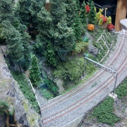 | 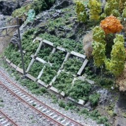 |
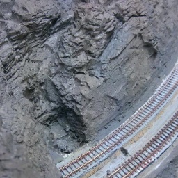
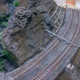
| Clockwise from top left, ① The “naked” stone; the different colors keep the stone from looking all the same. ② With a layer of topsoil, and the stream-side vegetation applied. ③ The module now sports some autumn foliage on the lowlands, plus the grid beams, already filled with undergrowth reclaiming the hillside. ④ Finally, with the addition of the conifers and the old seaside pine tree, the module is starting to look fairly respectable. |
After that, it was a matter of going crazy with vegetation. I had a number of deciduous trees I planted on the low-lying parts of the module, but transitioned to conifers along the rocky mountain stream. I left the shoreline devoid of trees; the salty water would likely kill anything except the most hardy plants. This also gives the module a more open and inviting composition.
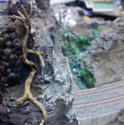
A while back I had found a weed’s rootball that had some very interesting, gnarled character, so I let it dry with an eye toward use as scenery. For this module, I broke off various bits and glued them to the rock cliff. The idea here was to model an ancient, wind-swept coastal pine clinging to the cliff face: something that nature had made into an impromptu bonsai. I like the look, but the roots are far too brittle so I’ll see about replacing them with something more durable.
| Old Seaside Pine |
 | 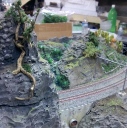 |
The smaller conifers were bulk purchases (thanks to Ebay) but the taller ones are filter-kabobs as per my earlier article. Remember that small collection of bare trunks from from the article? They were turned into trees in an hour-and-change over two days; the results are seen in the photos above. One update to that article: go the extra distance to really uncompact the filter; just when you think it’s lofted enough, take it a bit further so it looks like wisps that barely have anything left, and use that. You really want that light, airy look where the “branch” detail and the trunk are visible; the earlier editions were just too dense, and looked more like a tall, smothering thicket of kudzu-on-a-stick.
As with all modules, while this is approaching completion, it remains a work in progress. There are more details to add (the tunnel portals are placeholders, there’s a retaining wall or two still needed, the waves need more white-caps, et-cetera, et-cetera, et-cetera...) There are also some elements I’m inclined to change over time, too. But for now, it’s good enough to put onto the layout.
In any event, here are some pictures of the module in its present nearly-complete state:
| Train Meets |
 |  |
Stay tuned...


 Generate a QR code link to this page